 URBS 502—Analysis Using
Excel
URBS 502—Analysis Using
Excel
Many of the sections that will follow in this course use templates for Microsoft Excel worksheets. To use them effectively, you will need to know how to:
- Select and download data as needed (I use the Census website as an example)
- Clean up & organize the data in Excel
- Use Excel functions to analyze the data (eg, Min, Max, Av)
- Graph the data (and choose the appropriate type of graph to express what your analysis has found)
I.
Downloading Data (from the U.S.
A. Building the Data Base
1. Open a browser to http://factfinder.census.gov/.
2. Under Decennial Census, click the get data link.
3. Click the Custom Table link on the right side.
4. For the geographic type, select County under State on the drop down list
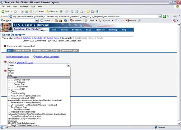
5. Select
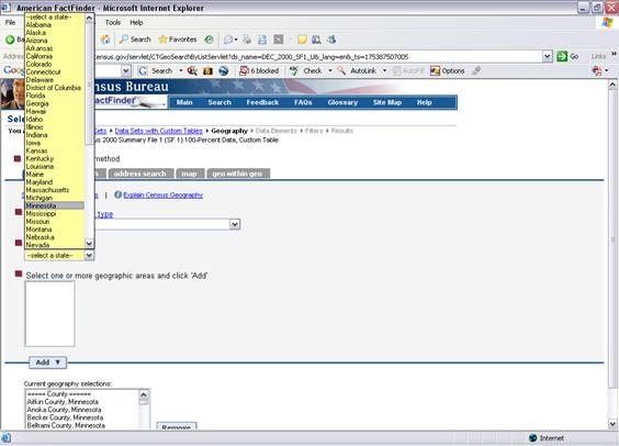
6.
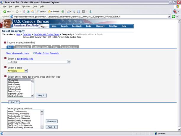
- For this example the following tables will be downloaded: Total Population (P1), Median Age by Sex (P13), Average Household Size (P17). Click the first table. Click Go. Each table needs to be added.
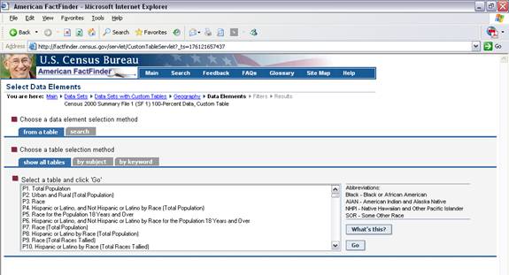
- Click the checkbox next to the data element. Click Add.
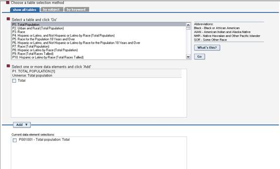
- Click Next when all tables and data elements have been added.
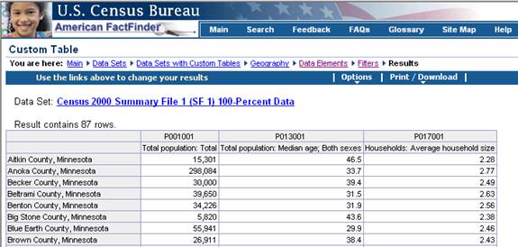
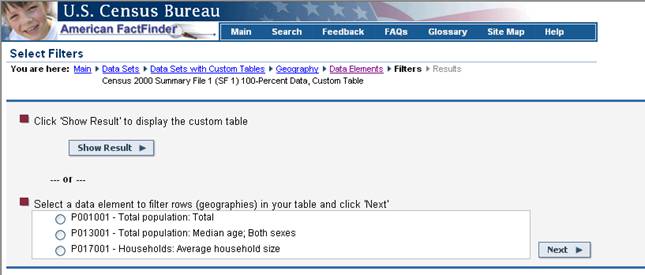
- Click Show Result to view the data.
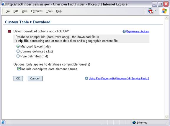
B. Downloading the data to Excel
1. Click the Print/Download link.
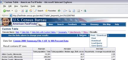
2. Click Download.
3. Click Microsoft Excel. Click OK.
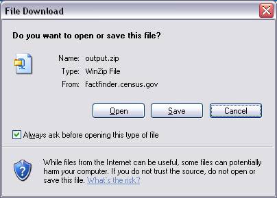
4. Click Open. (You may have to allow a pop up by clicking a yellow bar at the top of the screen.)
5. Click Save and choose a location to save the file to. This will save as a zip file.
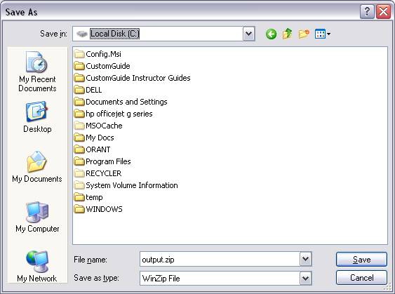
6. Double click the file to unzip it. This zip file contains 4 separate files. Save them to a CD, jump drive, etc.
II. Cleaning Up the Database in Excel
1. Open the Excel file (data).
2. Delete unnecessary columns and rows.
3. Adjust
column widths. ![]()
4. Use “Edit/ Replace” to clean up repetitive information
5. Use “Format” to automate how columns/rows/cells appear (Example: comma style, no decimal places)
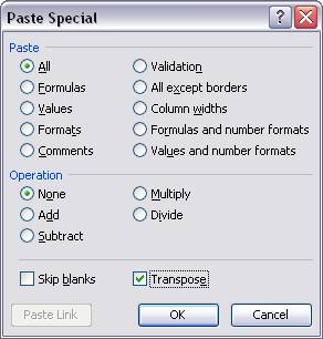
6. Transposing data:
Copy the data. Click where the data is to be placed. Click Edit, Paste Special and then click Transpose and click OK.
III. Using Functions
- Select a vacant cell in the spreadsheet where you want the results of the function to appear.
- In the top bar, click on “Insert,” or click on “fx” in the formula bar
- The “Insert Function” window will open. Note that you can narrow your search by “Select a Category”
- Select a function (a mathematical formula) that you want to use. Note that a definition appear at the bottom of the window when you highlight any function.
- A “Function argument” window opens, which asks you specify which range of values in the spreadsheet you want to use for applying the function. Note that it gives you a preview of the formula results at the bottom of the window. You can specify the range by typing in the cell addresses, or just highlight them and click “return.”
- The function will be saved in the cell you specified, and will display the formula results.
You can use the function menu to calculate most statistics—sums, averages, ranges, even correlation, chi-square, student’s t, and analysis of variance.
IV. Graphing the Data
Create
a Scatter or Line chart
1. Arrange your data so that the x-values are in the first row or column of your worksheet, and the y-values are located in adjacent rows or columns.
2. Select the range of x- and y-values that you want to plot in the chart.
Embedded Charts and Chart Sheets
You can create a chart on its own chart sheet or as an embedded chart on a worksheet. Either way, the chart is linked to the source data on the worksheet, which means the chart is updated when you update the worksheet data.
A chart sheet is a chart that can be created in one step. It is a separate sheet within your workbook that has its own sheet name. Use a chart sheet when you want to view or edit large or complex charts separately from the worksheet data or when you want to preserve screen space as you work on the worksheet data.
To create a chart sheet:
1. Select the data to be included in the chart.
2. Press F11 on the keyboard. A chart sheet is created using the default chart (column chart).
An embedded chart is considered a graphic object and is saved as part of the worksheet on which it is created. Use embedded charts when you want to display or print one or more charts with your worksheet data.
To create an embedded chart using the Chart Wizard:
1. ![]() Select
the data to be included in the chart.
Select
the data to be included in the chart.
2. Click on the Chart Wizard button on the Standard toolbar.
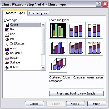
3. From Step 1, choose a chart type and chart sub-type then click Next.
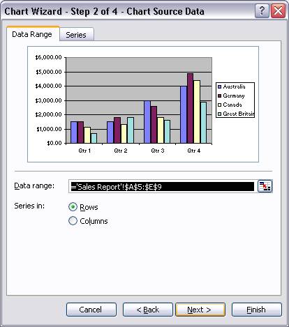
4. In Step 2, confirm or change the data range or series configuration then click Next.
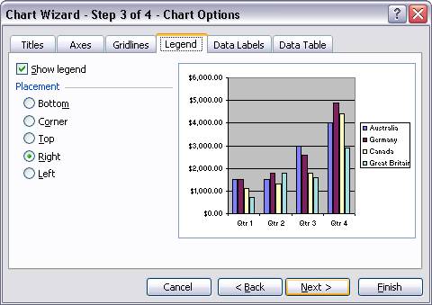
5. In Step 3, make any changes to the titles, axes, gridlines, legend, data labels, or data table then click Next.
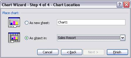
6. In Step 4, choose the location for the chart then click Finish.
7. Once you click Finish you will have created a chart based upon the data you selected in Step 1. When you create a chart the Chart toolbar should open automatically. If the toolbar does not open, click View, Toolbars, Chart to open the Chart toolbar.
Using the Chart
Toolbar
Several aspects of the chart can be changed by using the Chart toolbar.
![]()
1. 2. 3. 4. 5. 6. 7. 8. 9.
- A drop down box that is used to select objects on the chart.
- Format legend button opens the format box so you can change the font, size, color, etc of the legend.
- Chart type button is used to change the type of chart after the chart has been created.
- Legend button is used to turn the legend on and off.
- Data Table is used to turn the data table on and off. A data table is data used to create the chart.

By Rowchange the order, placement, and worksheet orientation of data series in a chart.
 By Column
- Angle Clockwise will rotate the axis titles clockwise.
- Angle Counterclockwise will rotate the axis titles counterclockwise.
© 2006 A.J.Filipovitch
Revised 18 January 2010